Samepage
2016
—
Rebranding a healthcare startup company in Seattle
—
Lead Designer_
Samantha Ricca
Strategy/Design Advisor_
Melissa Martin
Overview
Samepage is a software suite used by physicians, clinicians, and patients as a health management tool for multiple chronic conditions including mental illness. It is a tool subject to human interaction and it also houses medical data.
Much of Samepage's work deals with influencing habitual change in their patients for a healthier lifestyle. The client felt their brand needed a refresh to convey its authority in this space as medical experts,but still be humanistic enough for patients to feel a connection to it.

Discovery
The images and forms that inspired the development of this brand were both technical and organic. It was important to have the interplay between scientific and organic change be part of the brand's visual presence.

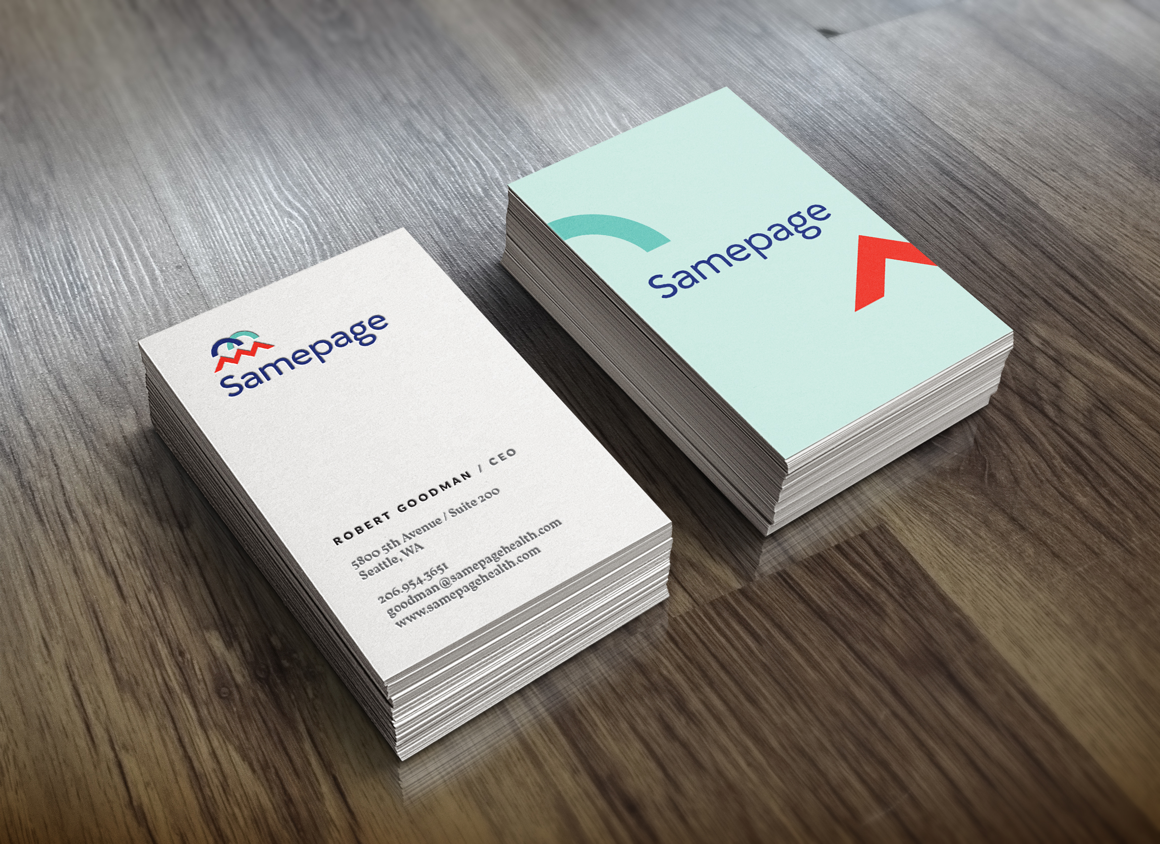
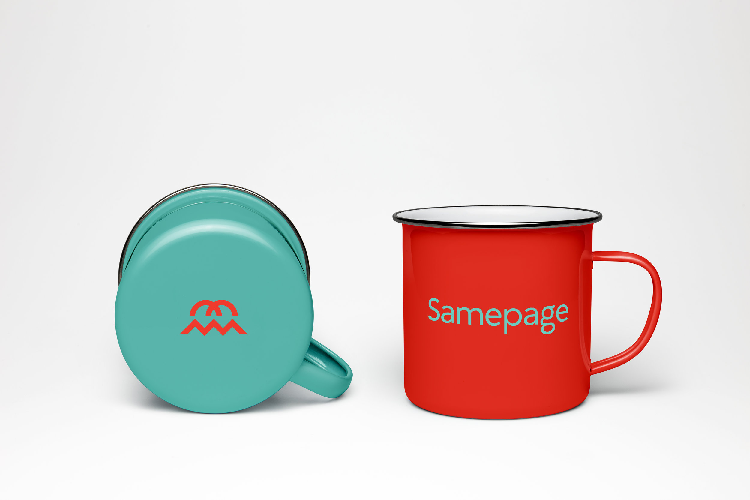
Logo Development
I used pattern and rhythm as the visual building blocks for the brand. The logo itself is simple, modern, and nods to the interdependencies in the process of change.
Logo Mark
_
I began with simple abstract shapes and used them as building blocks to create logomarks that illustrated transition and unity. Much of the Samepage process/tool deals with transition—transition from a state of being unwell to being healthy and whole. Each of these marks signifies a point in that transition, and as a whole speaks to the unified self.
Components

Word Mark
_
The wordmark was created to be both friendly and serious at the same time by angling the spurs and only slightly rounding the corners.

Brand Architecture
Brand Mark
_

Horizontal Signature
_

Stacked Signature
_

Sub-brands
_